Sephora Squad's App
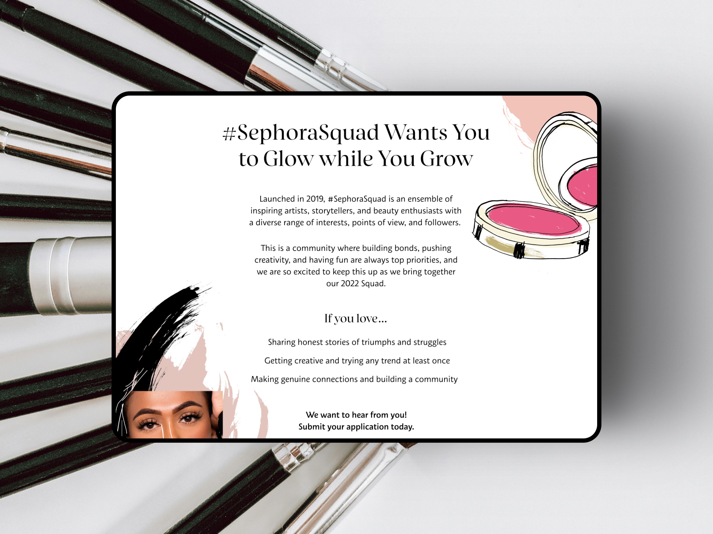
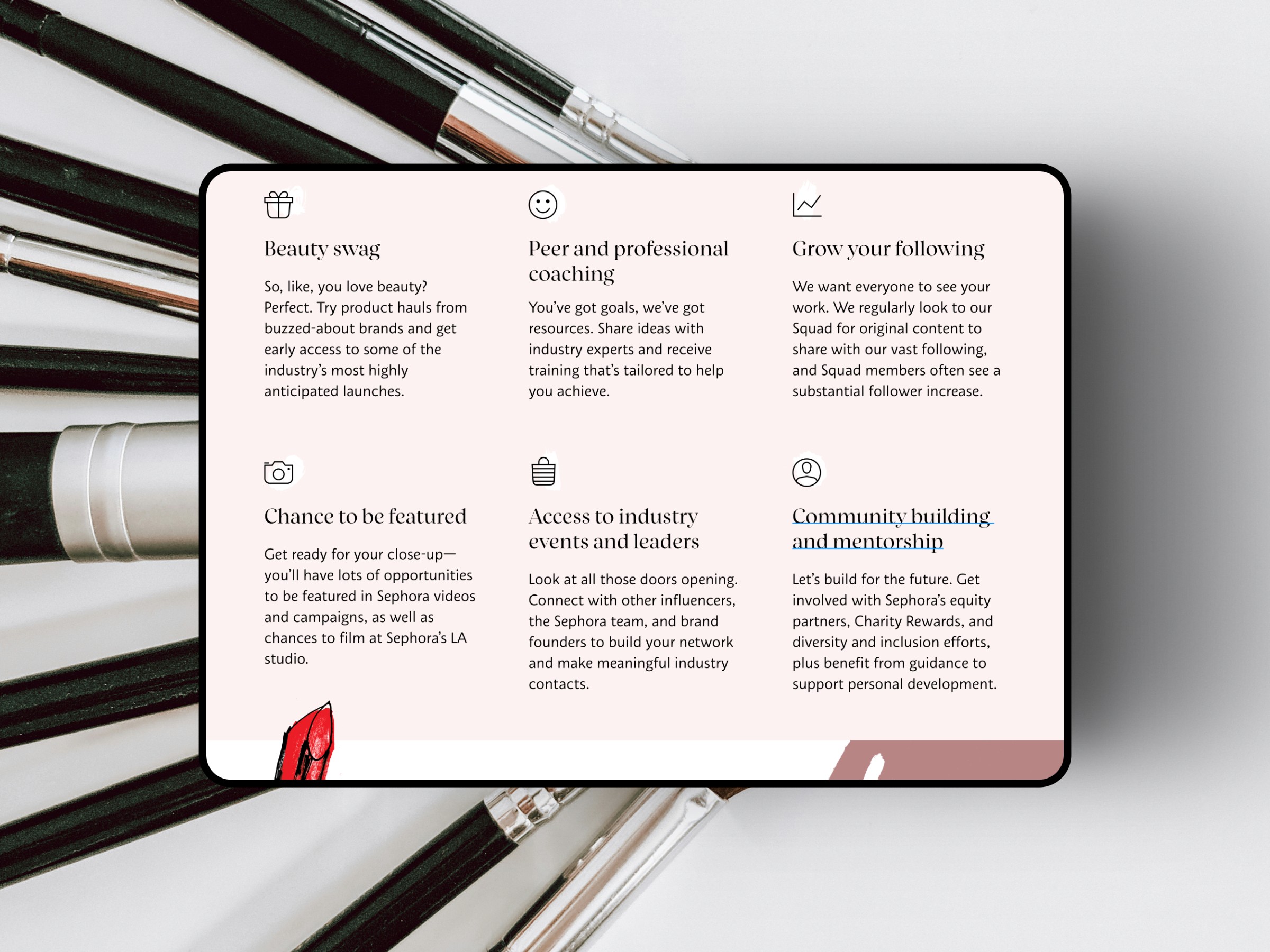
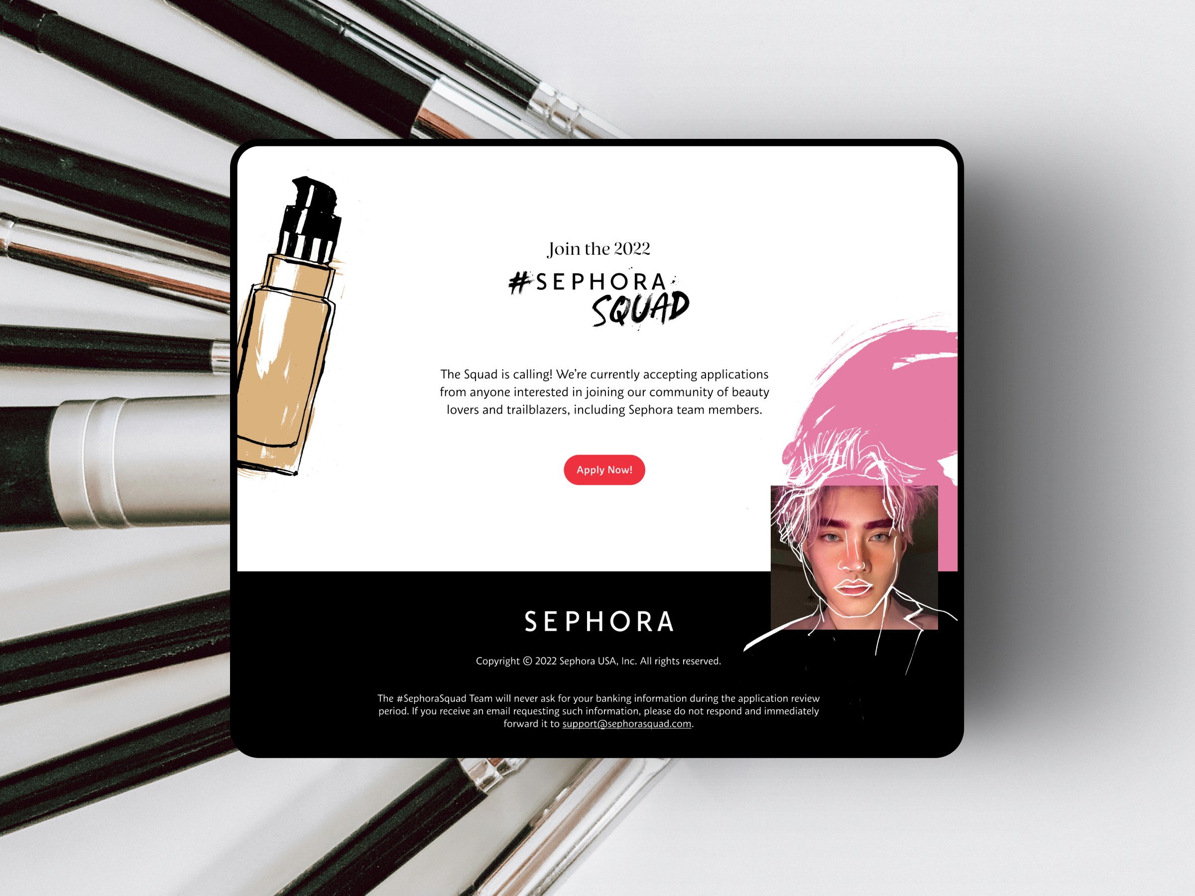
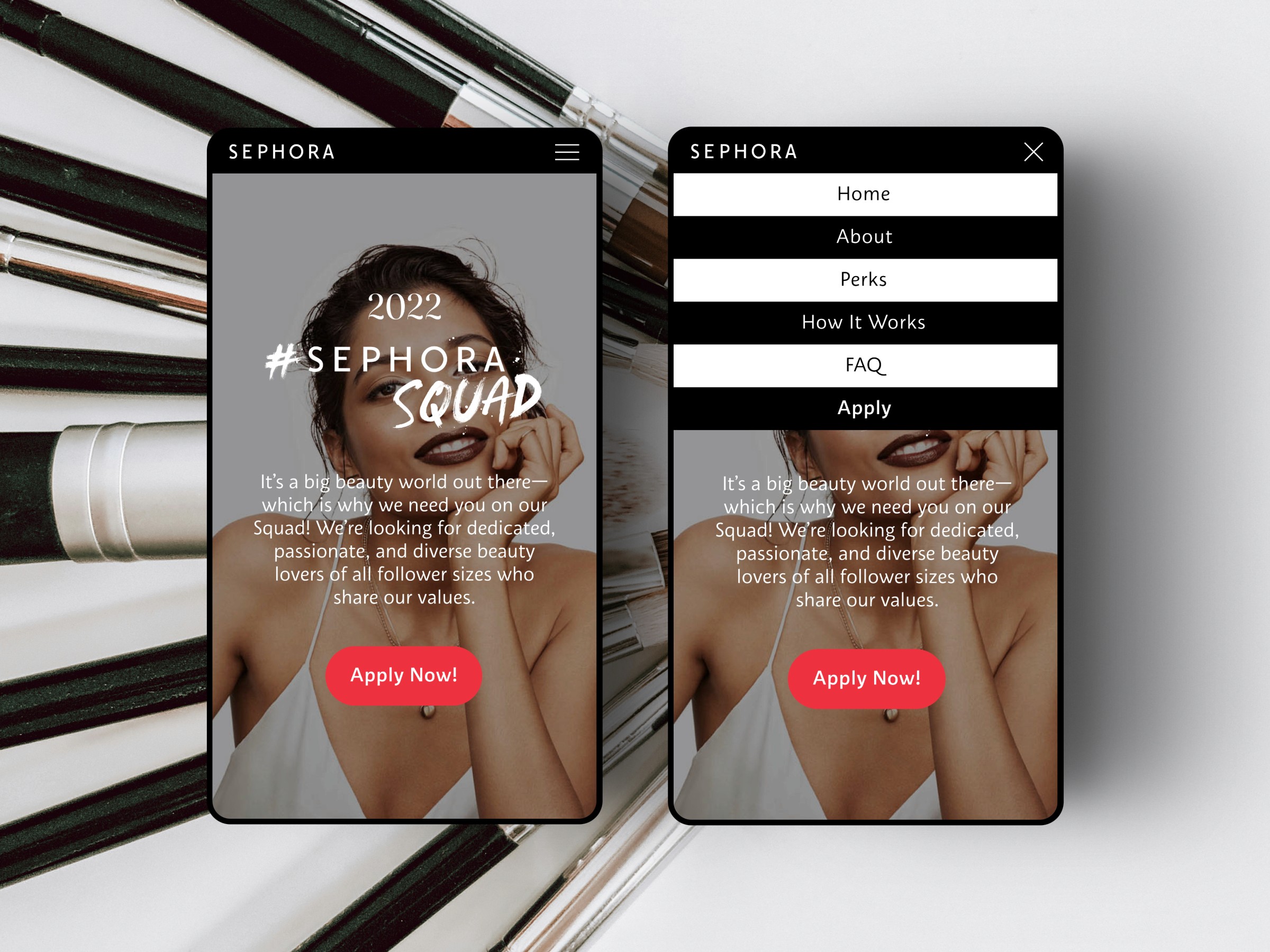
Sephora Squad is one of the most influential creator programs in the beauty world. As the design lead, I helped redesign the full application and onboarding experience to make it easier, clearer, and more inspiring for thousands of creators applying each year. The goal was to transform a complex process into a smooth and engaging journey that supports applicants at every step and helps Sephora identify authentic voices in its community. This project combined product strategy, UI clarity, and emotional storytelling. The experience needed to feel premium and inclusive while still being highly functional for the internal team reviewing thousands of submissions. — Customer Problem Creators found the application process confusing and intimidating. Requirements were scattered, expectations were unclear, and many applicants dropped off before completing their submission. The experience did not fully capture the inspiration and energy that Sephora Squad represents. — Business Problem Sephora needed a more streamlined system to help review and process large volumes of applications without slowing down the internal team. The existing workflow created a lot of manual work and added friction for stakeholders managing the program. A stronger experience would support better stories, stronger data, and a smoother path from application to selection. — Goal Design a more intuitive, inspiring, and efficient application experience that helps creators tell their story with confidence while reducing operational load for Sephora’s internal team. — Understand I led conversations with Sephora’s internal partners, community managers, and previous Squad members. We mapped where users abandoned the process and uncovered the moments where the experience felt unclear or frustrating. Key insights included: • The application felt long and overwhelming • Creators wanted guidance and examples • Internal teams needed cleaner data and better formatting • Brand identity was strong but not fully expressed in the product These insights shaped the early direction and clarified what needed to be improved. — Define Based on the research, I focused the experience around three core priorities: 1. Clarity Step by step structure Clear requirements Visual cues that reduce mental load 2. Creativity and self expression Space for authentic voices Easy access to examples A layout that highlights personality and content 3. Operational support A more organized submission structure Cleaner data for reviewers Reduced back and forth — Create & Test I redesigned the full application flow from the ground up. Every screen was crafted to be simple, welcoming, and aligned with Sephora’s brand. I introduced a modular layout that worked across desktop and mobile and supported both long-form writing and short-form content. Highlights of the design process: • A clear step by step journey with progress indicators • Simplified content uploads • Strong visual hierarchy across each question • A clean framework that made the review process faster • Accessible design choices that supported a diverse creator community I collaborated weekly with developers to keep implementation aligned and maintain visual polish throughout the build. — Impact The redesigned experience improved clarity, increased completion rates, and strengthened the storytelling quality of applications. Internal teams reported less friction during review, cleaner data, and a smoother workflow. The refreshed identity helped Sephora present the Squad as a premium and community centered program while making the process more accessible to a wider group of creators.